
Redesigning the Homepage for Better UX & Engagement
Time
Dec 2024 - March 2025
Role
UI/UX Designer
Contributions
Design Exploration & Refinement
Responsive Design
Visual Asset Creation
Dev Handoff & QA
Deliverable
Hi-Fidelity Homepage Design
Desktop and Responsive Designs
Overview
The homepage serves as the first impression of a product, and this redesign aimed to improve usability, engagement, and brand consistency while ensuring responsiveness across devices. My role focused on refining the design, creating visual assets, ensuring design system consistency, and leading developer handoff and QA.

Before
AfterChallenges in the Original Design
Outdated Visual Style – The original homepage lacked the refreshed branding elements, such as updated color schemes, graphic elements, and refined components.
Inconsistent UI – Some elements didn’t fully align with the new design system, impacting visual cohesion.
Lack of Interactivity – The page felt static and did not engage users with micro-interactions or animations.
Lack of Responsive Optimization – The desktop layout needed better adaptations for mobile and tablet experiences.
Exploring the Concept
The homepage redesign began as a collaborative effort across our design team, where we collectively explored the visual direction and structure of the new page. We started by pulling inspiration from industry-leading websites, design galleries, and UI trend resources to spark ideas. We broke the page into key sections—hero, product features, value props, social proof, and CTA banner—and explored multiple design concepts for each. These sessions were fast-paced and exploratory, allowing us to play with different layouts, interactions, and brand expressions.

Initial Design Concept
Through ongoing feedback, we refined the direction and aligned on a unified vision that balanced visual impact with usability and brand consistency.
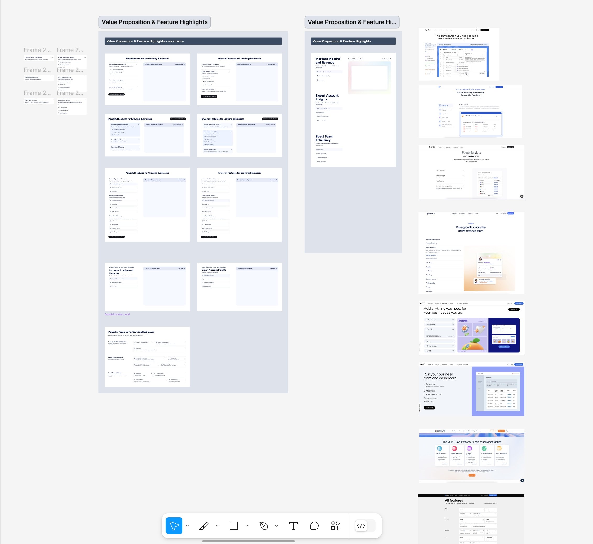
Design Refinement - the Value Prop Section
For the value proposition section, I focused on refining both the visual clarity and interactive behavior to create a more engaging, guided experience. The layout features a tabbed interface on the left that allows users to explore key product benefits, while the right side displays contextual product illustrations that update in real time as each tab is selected. To enhance storytelling on scroll, the image container remains fixed while the left-side content transitionsbetween value props—maintaining visual context and reducing cognitive load. I also created all the custom product illustrations, ensuring they aligned with the refreshed brand style and clearly communicated each feature’s value.
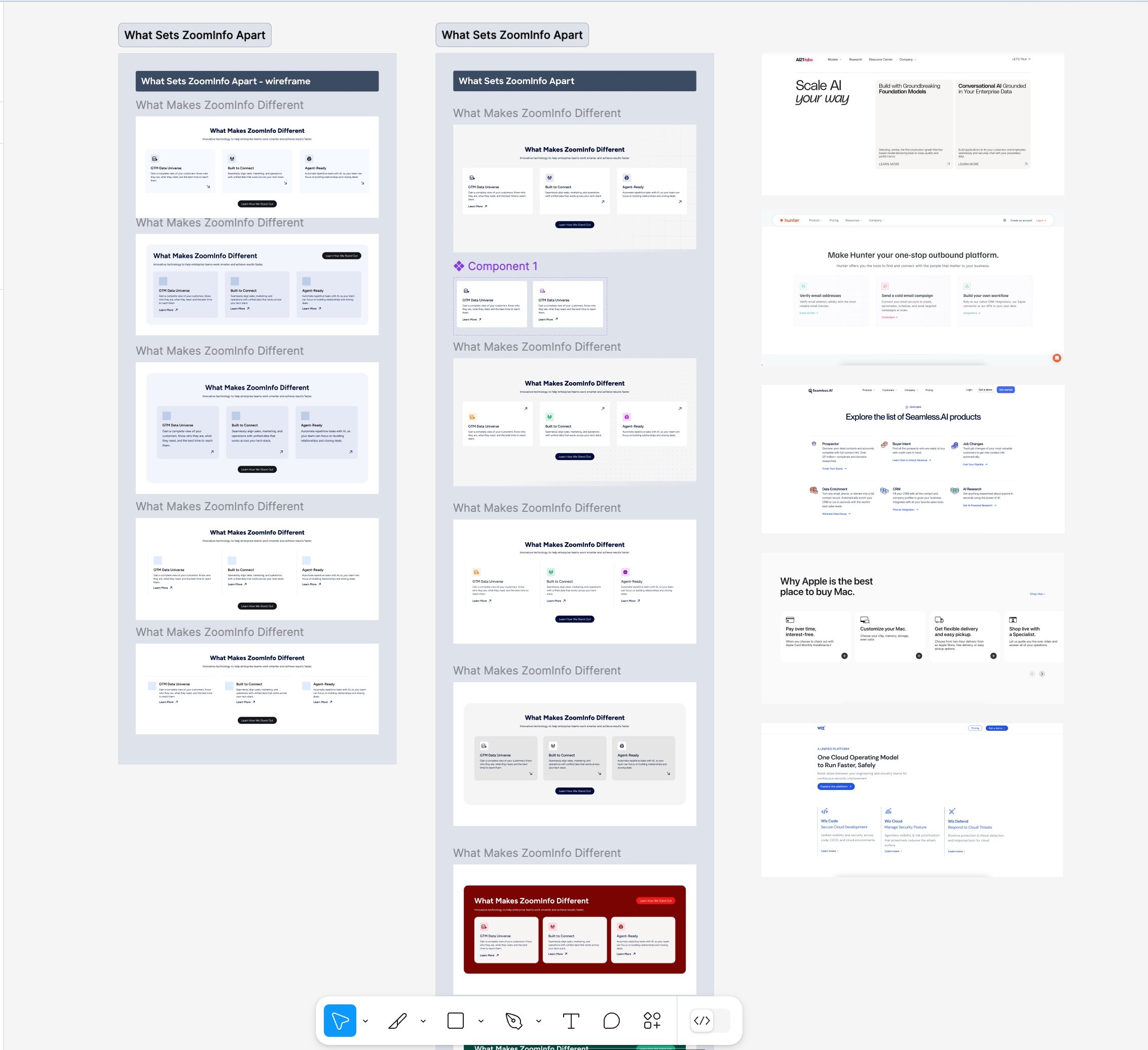
Design Refinement - Card Section
For the GTM Data Universe card section, my focus was on improving visual clarity, consistency, and layout rhythm. I refined the card structure to ensure a balanced hierarchy between headlines, descriptions, and CTAs—making it easier for users to scan and understand each value prop at a glance. I adjusted spacing, alignment, and typographic scale to better reflect our design system and maintain a cohesive look across the homepage. Subtle visual enhancements, like a soft glow gradient on the active card, were introduced to create a sense of interactivity and focus without overwhelming the experience. The result is a clean, structured section that effectively communicates multiple product benefits in a digestible and visually consistent way.
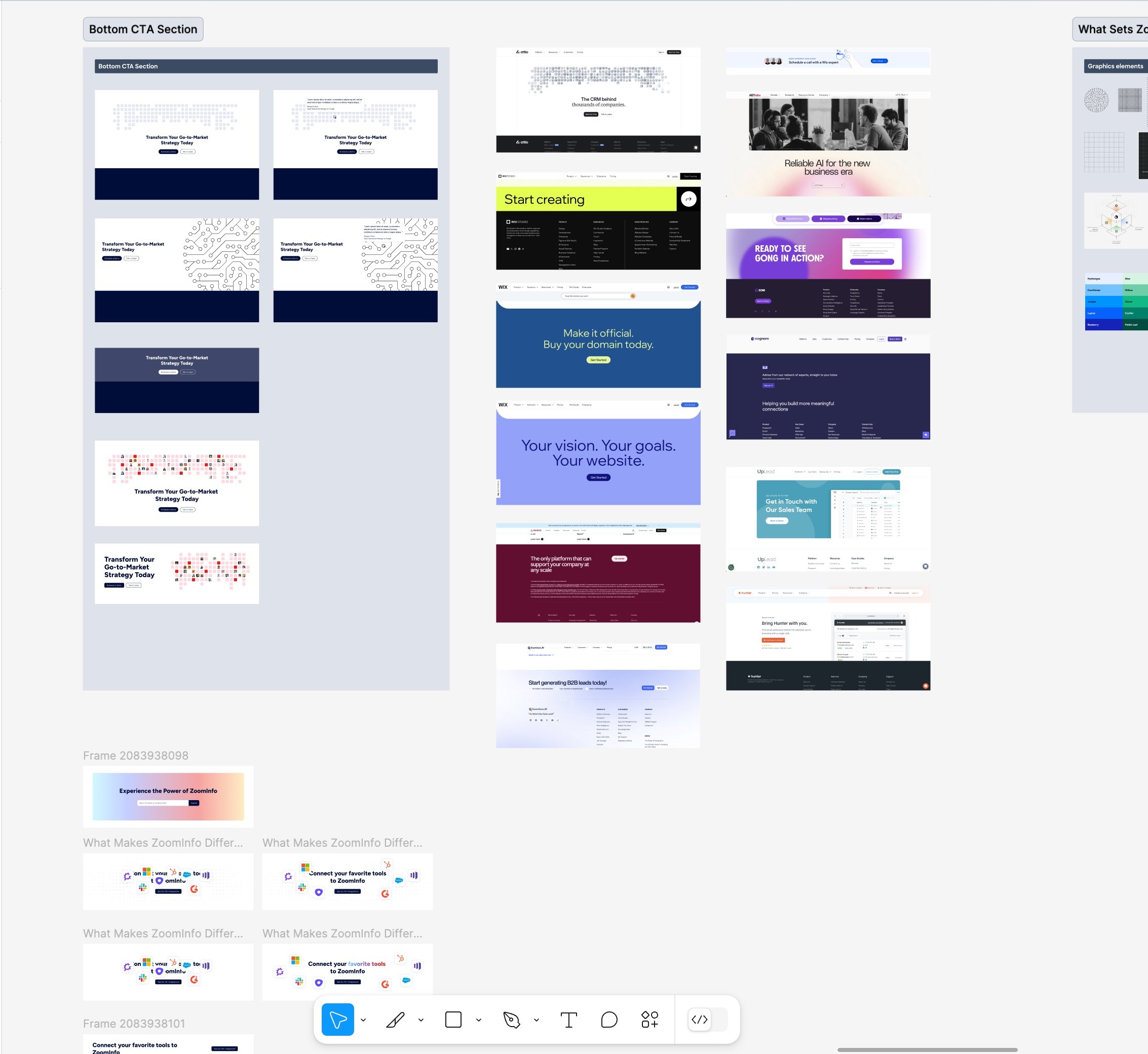
Design Refinement - Footer CTA
For the footer call-to-action section, I focused on making the design more visually impactful and aligned with the refreshed brand language. I refined the layout to create a strong visual anchor near the end of the page, ensuring the headline had presence and clarity while maintaining a clean, scannable structure. The background grid of avatar tiles was enhanced to create a subtle yet dynamic sense of movement and community, supporting the testimonialwithout overwhelming it. I also fine-tuned the typography, spacing, and CTA button styling to improve hierarchy and make the call-to-action feel more inviting and actionable.


Final Design
The final homepage design brings together our refreshed brand identity, interactive storytelling, and improved content structure into a cohesive, responsive experience. Every section—from the hero to the CTA—was carefully refined to ensure visual clarity, alignment with the design system, and optimized usability across screen sizes.
The use of subtle gradients, thoughtful spacing, and dynamic interactions enhances both the aesthetic and the functionof the page. Custom product illustrations support key messaging, while interactive elements like tabbed content, anchored visuals, and smooth scroll transitions guide users through the content intuitively.
The result is a modern, high-performing homepage that communicates ZoomInfo’s value clearly while encouraging engagement and conversion.


Responsive Design
As part of the redesign, I created tailored layouts for tablet and mobile to ensure the homepage delivered a seamless experience across all devices. I carefully adjusted typography, spacing, and layout hierarchy to maintain clarity and usability at smaller breakpoints.
Interactive elements—like tabbed content, image transitions, and call-to-actions—were optimized for touch interactionand vertical scrolling. I collaborated closely with developers to ensure design fidelity across breakpoints during implementation, addressing edge cases and providing solutions for content stacking, scaling, and accessibility.
The result is a responsive experience that feels intentional and user-friendly, regardless of screen size.


🚀 Developer Handoff & QA
Delivered annotated design specs with interaction guidelines.
Worked closely with developers to ensure smooth implementation of animations.
Conducted QA testing, ensuring animations performed well and design consistency was maintained.
🎉 Final Outcome & Impact
Modernized Visual Identity – Successfully implemented the brand refresh on the homepage.
Improved Engagement with Motion – Introduced animations that enhance user experience without overwhelming the design.
Seamless Responsive Experience – Ensured consistent layouts across devices.
Stronger Developer Collaboration – Delivered well-documented handoff, making the transition smooth.
🌟 Takeaways & Learnings
Subtle Interactions Make a Big Impact – Small micro-interactions can dramatically improve engagement and page flow.
Balancing Brand & UX Is Key – Merging brand elevation with functional usability improvements created a better user experience.
Developer Collaboration Ensures Success – Clear documentation and feedback loops helped bring the animationsand visual refinements to life.