Designing Modular ABM Landing Page Templates
Time
Feb 2024 - March 2025
Role
Lead UI/UX Designer
Contributions
Design Exploration & Refinement
Visual & Brand Alignment
Component System Creation
Responsive Design
Dev Handoff & QA
Deliverable
Modular Landing Page Template System
Desktop and Responsive Designs
Overview
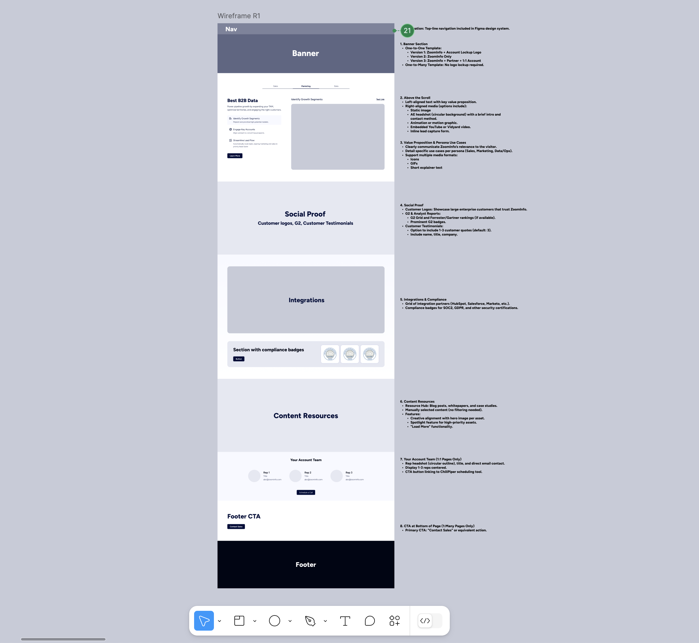
To support ZoomInfo’s ABM strategy, I led the design of 1:1 and 1:Many landing page templates in PathFactory, built to enable rapid personalization for upmarket audiences while maintaining brand consistency. The goal was to create a scalable, modular system that could adapt to various industries, personas, and campaign types—helping Sales and Marketing teams deliver targeted content with faster turnaround and higher engagement.
1:1 Template1: Many TemplateDesign Goals
Enable rapid page creation for enterprise and STRAT accounts.
Support dynamic content based on industry, persona, or account.
Boost engagement and conversions through relevant use cases, social proof, and content.
Create a scalable, editable framework within PathFactory.


Exploring the Concept
We began with a cross-functional discovery phase, aligning with stakeholders from Sales, Demand Gen, and Field Marketing to identify key requirements and content needs. We reviewed the requirements and defined opportunities for flexibility, branding, and scalability. I broke the design into modular sections and collaborated with the team to explore variations for personalization, content layout, and CTA placement—leading to a system that supports both strategic targeting and ease of use.
Modular Design System - Flexible Hero Variants
The hero section was designed with maximum flexibility to support varying levels of personalization across 1:1 and 1:Many landing pages. Visually, it can adapt to several formats—from a simple copy-forward layout with testimonial quotes, to rich, image-driven variations featuring AE headshots or industry-specific personas. In 1:1 pages, we also supported co-branded logo lockups (e.g., ZoomInfo + Account or Partner) to signal a customized experience right at the top. Media options include testimonial carousels, AE headshots with name and title overlays, or illustrated personas paired with contextual callouts. The hero is also built to support embedded videos or inline lead forms, giving teams the flexibility to tailor the experience based on audience, intent, and campaign goals—without compromising visual consistency or responsiveness.
Modular Design System - Your Account Team Section (1:1 Only)
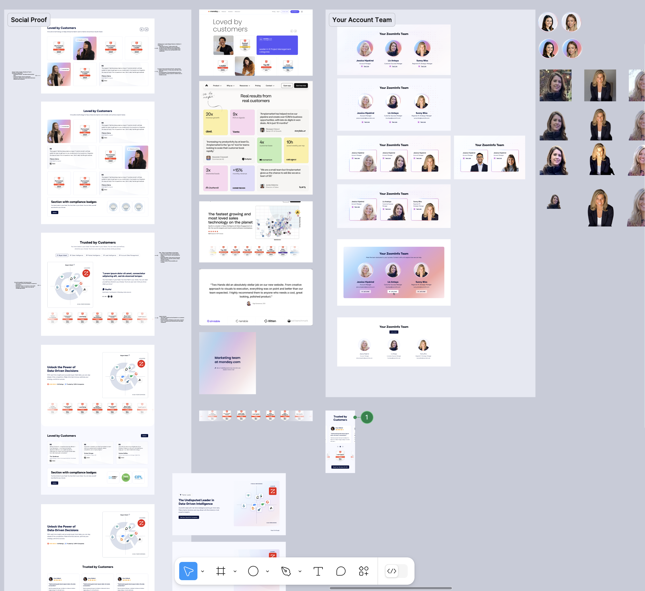
For 1:1 pages, we designed a dedicated team section to introduce the specific reps supporting the account—adding a human touch to the personalized experience. This section highlights up to three team members, each with their headshot, name, and title, styled within branded cards that match the overall look and feel of the page. A prominent “Let’s Chat” CTA anchors the section, designed to link directly to a ChiliPiper scheduling flow, enabling visitors to easily book time with their assigned team. This approach not only builds trust and credibility but also helps accelerate engagement by giving decision-makers a clear next step with real people, not just a form.
Modular Design System - Social Proof
To establish instant credibility with high-value prospects, we designed a flexible social proof section featuring third-party validation from trusted sources. This block combines G2 badges, Forrester Wave visuals, and analyst quadrant graphics to highlight ZoomInfo’s leadership across buyer intent, data intelligence, and go-to-market solutions. The visual layout is modular, allowing marketers to swap between G2 Grid visualizations, comparison overlays, or analyst badges, depending on campaign focus. We also included the option to feature customer logos, testimonial quotes, and a consistent “Market Leader” tag to further reinforce trust. The quadrant-style layout visually positions ZoomInfo as the clear leader among competitors—an effective, scannable way to communicate authority and industry recognition.
Modular Design System - Integration
To highlight ZoomInfo’s powerful tech ecosystem and build trust with enterprise buyers, we created a dynamic Integration & Compliance Grid. This section features partner logos (like Salesforce, Marketo, Slack, and HubSpot) displayed in a center-out animation, creating a sense of momentum and connectivity as logos expand outward on load. Designed as a shared component within our design system, this block maintains visual consistency across both our ABM templates and the corporate website.
Modular Design System - Footer CTA
To drive action at the end of each page, we designed a flexible Footer CTA component tailored for both 1:1 and 1:Many ABM strategies.
On 1:1 pages, the footer includes co-branded logos and a bold headline, reinforcing partnership alignment and delivering a high-touch, personalized close. This component is consistent with ZoomInfo’s broader corporate design system, ensuring visual continuity across marketing touchpoints.
For 1:Many pages, the footer shifts to an industry-specific message (e.g. Finance, Insurance), designed to resonate with targeted segments while maintaining scalability. All variations feature a prominent CTA button—such as “Schedule a Call”—to capture interest and support campaign conversions. The modular structure allows the marketing team to quickly adapt the content based on campaign type without sacrificing clarity or brand integrity.
Final Design
The final deliverables included two fully designed templates—one for personalized 1:1 experiences and another for scalable 1:Many outreach—along with a flexible component library in Figma. The layouts follow ZoomInfo’s brand system and align with PathFactory’s design framework, enabling marketing teams to deploy campaigns quickly while maintaining high design quality.
Tablet
Mobile
Responsive Design
All components were designed with mobile and tablet responsiveness in mind. I tailored layouts to preserve structure and readability across breakpoints, ensuring visual consistency and usability across devices. Interactive elements, such as embedded videos and CTA blocks, were tested and optimized for smaller screens to reduce friction and maintain performance.
🚀 Developer Handoff & QA
I led the design handoff to PathFactory’s third-party dev team, providing detailed specs, responsive guidelines, and annotated Figma files to ensure clarity.
Given the external nature of the team, the QA process was more involved—I conducted multiple review rounds, flagged visual and functional issues, and worked closely with both internal stakeholders and PathFactory to maintain design accuracy and performance throughout implementation.
🎉 Final Outcome & Impact
Enabled marketing and SDR teams to create custom landing pages faster, with less design lift.
Delivered a flexible foundation for ongoing ABM experiments (messaging, CTAs, layouts).
Improved campaign consistency and professionalism across channels.
Received positive feedback from internal stakeholders for both usability and visual quality.
🌟 Takeaways & Learnings
This project strengthened my experience in scalable system design, cross-functional collaboration, and personalization strategy. Designing with flexibility in mind allowed us to support evolving ABM needs without sacrificing brand integrity or speed of execution.


